Geyer, L. H., & Gupta, S. M. (1981). Recognition/confusion of dot matrix
vs. conventional font capital letters. Perception &
Psychophysics, 29, 280-282.
Summary:
Procedure:
The authors used a subset of nine uppercase letters (E, F, I, L,
T, H, M, N, & W) presented tachistoscopicly. Letters
subtended .55% vertical angles, and duration was controlled
for correct recognition across fonts of 50% (no other
details given). There was apparently data from 24
participants, each of whom took part in 2 font conditions.
Stimuli
Three fonts were used: dots, "stroked" font letters with
serifs, and "filled", which had letter forms identical to
the dots, but the spaces between the dots were filled in.
In the image below, the first line is the dots condition,
the second line is the filled, and the third line is the stroked.
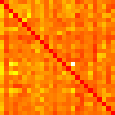
Results
Transcribed confusion matrices for the three conditions are
found here: Dots, Filled, Stroked. For each, rows
sum to roughly 1.0, implying that each row indicates a
presented stimulus, and each column represents a response.
No guarantee about accurate transcription is implied.

 Back to main Letter Similarity Data Set Archive Page